
Deva — A fresh perspective on healthcare
Deva’s healthcare story, told in turquoise, flowing forms and simple lines. We kept the design fresh and approachable.


Deva’s colours. A simple visual language.
Turquoise, blue and fine-line icons. We brought Deva’s healthcare story together around these simple visual choices.
- Light turquoise
- Blue
- Dark blue
Overview
We approached Deva’s work in healthcare with a clear, calm design. Fresh turquoise, a flowing three-dimensional form and fine-line icons work together. From its activities to its corporate values, the design keeps the human side of the brand in view.
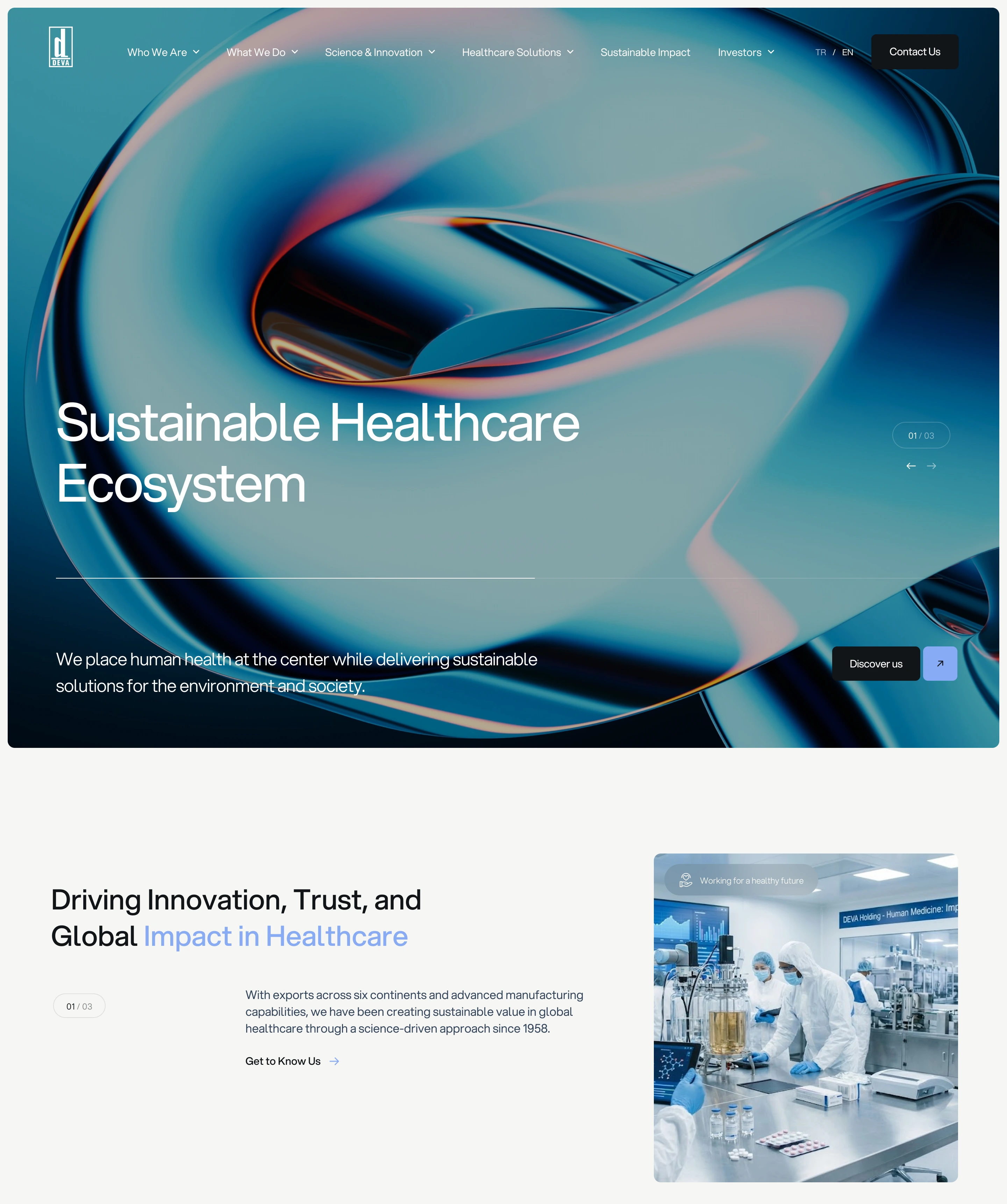
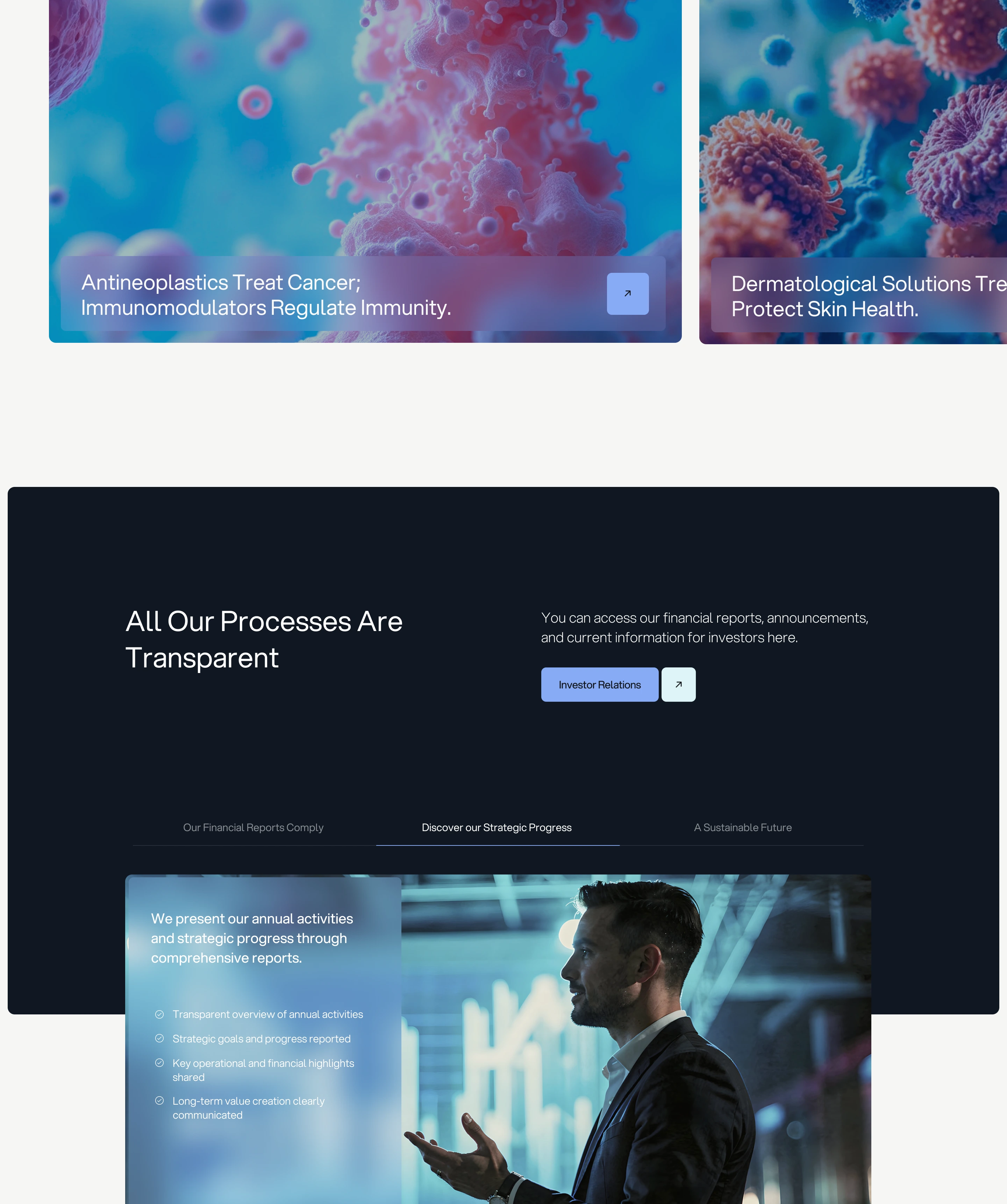
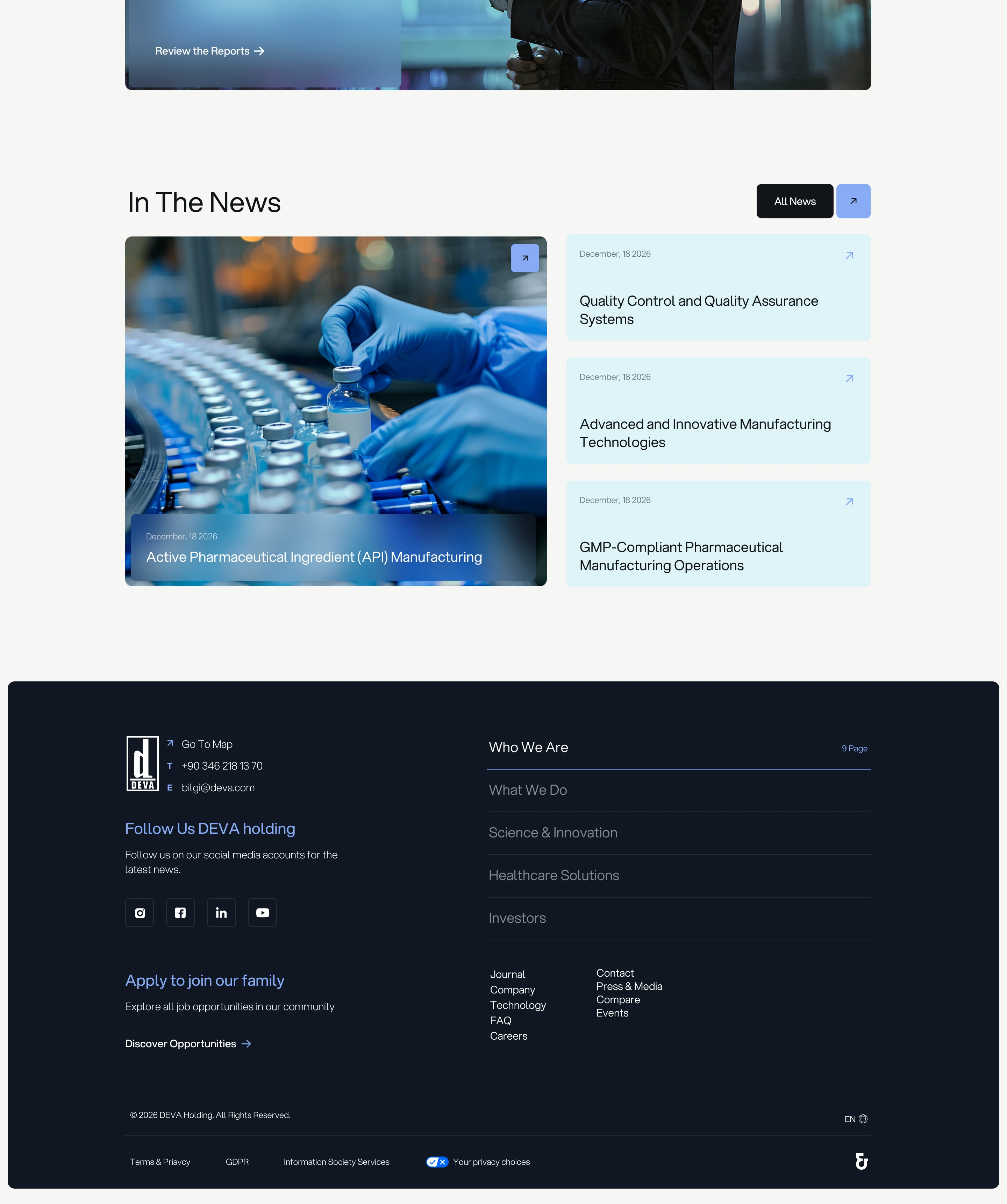
An open, fresh introduction to Deva’s healthcare world. Turquoise tones and a flowing form bring a softer expression to the brand’s corporate presence.
Gallery
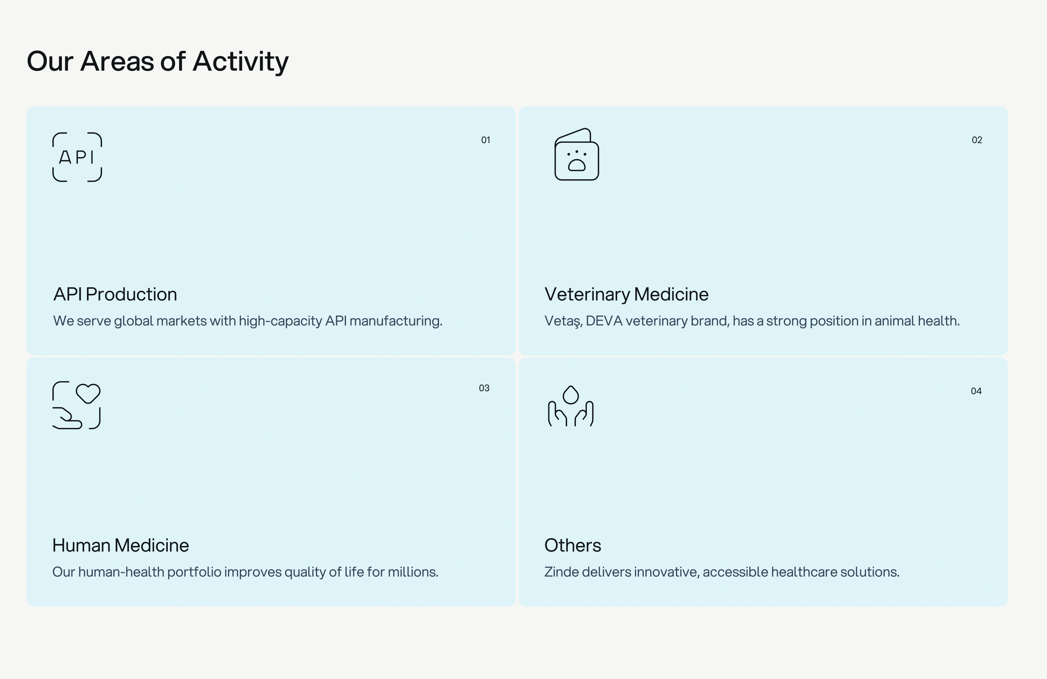
Different fields. The same Deva touch.
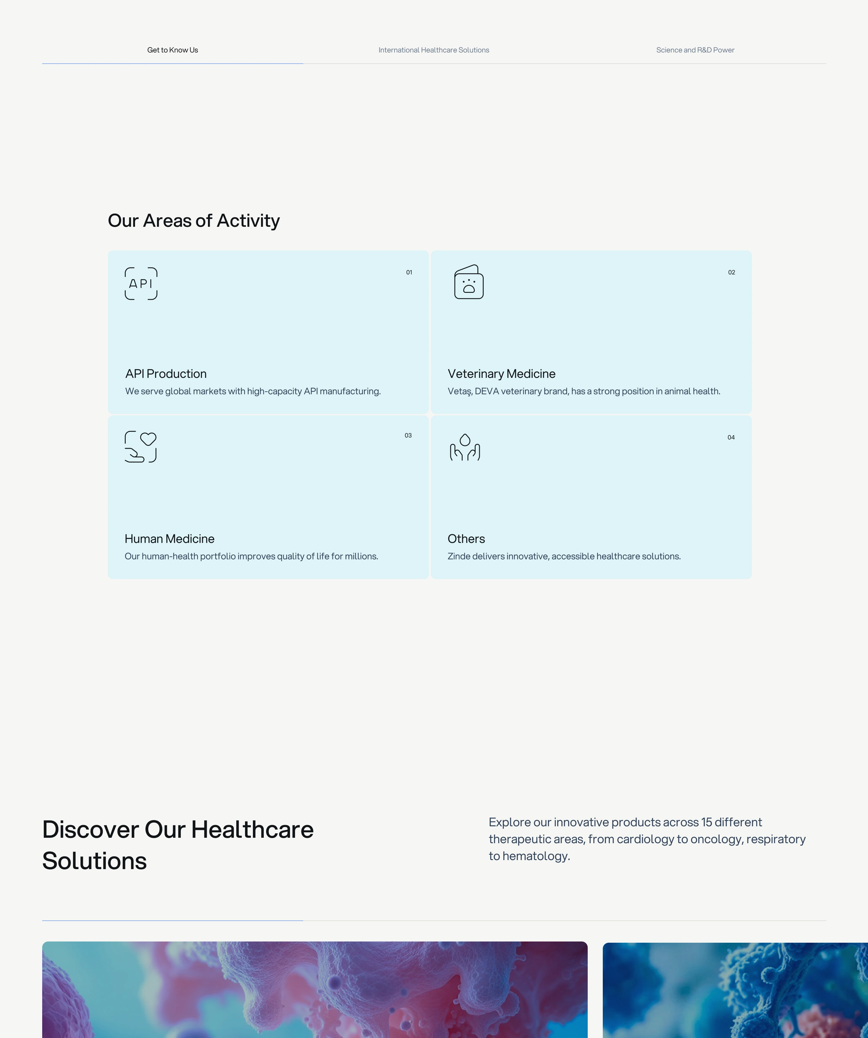
Hands, hearts and lines that suggest life give Deva’s activities a familiar language. Light turquoise brings these different areas of healthcare together in the same calm tone.
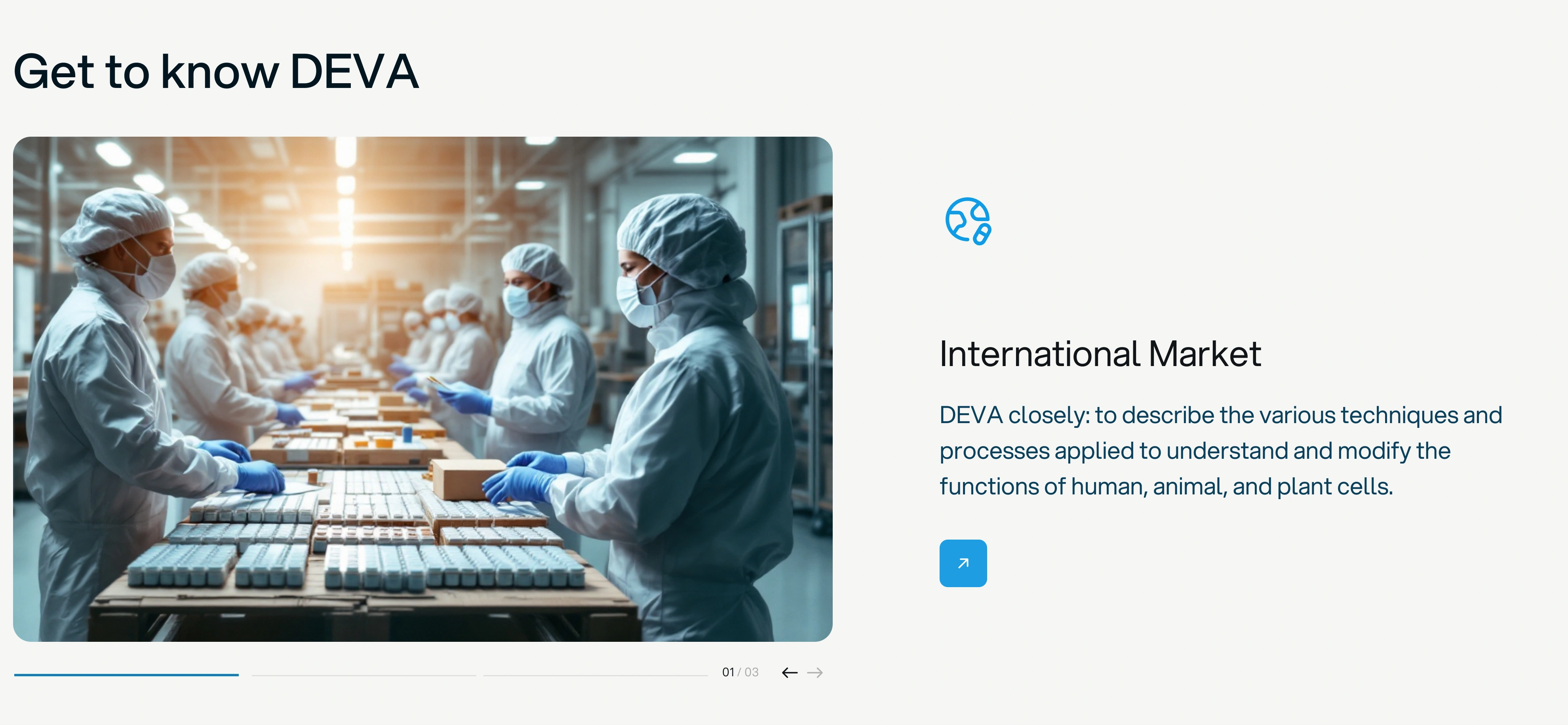
Closer to Deva’s world.
The work behind healthcare has a place in Deva’s story. A view into the production setting invites visitors to look beyond the name and into the brand’s world.
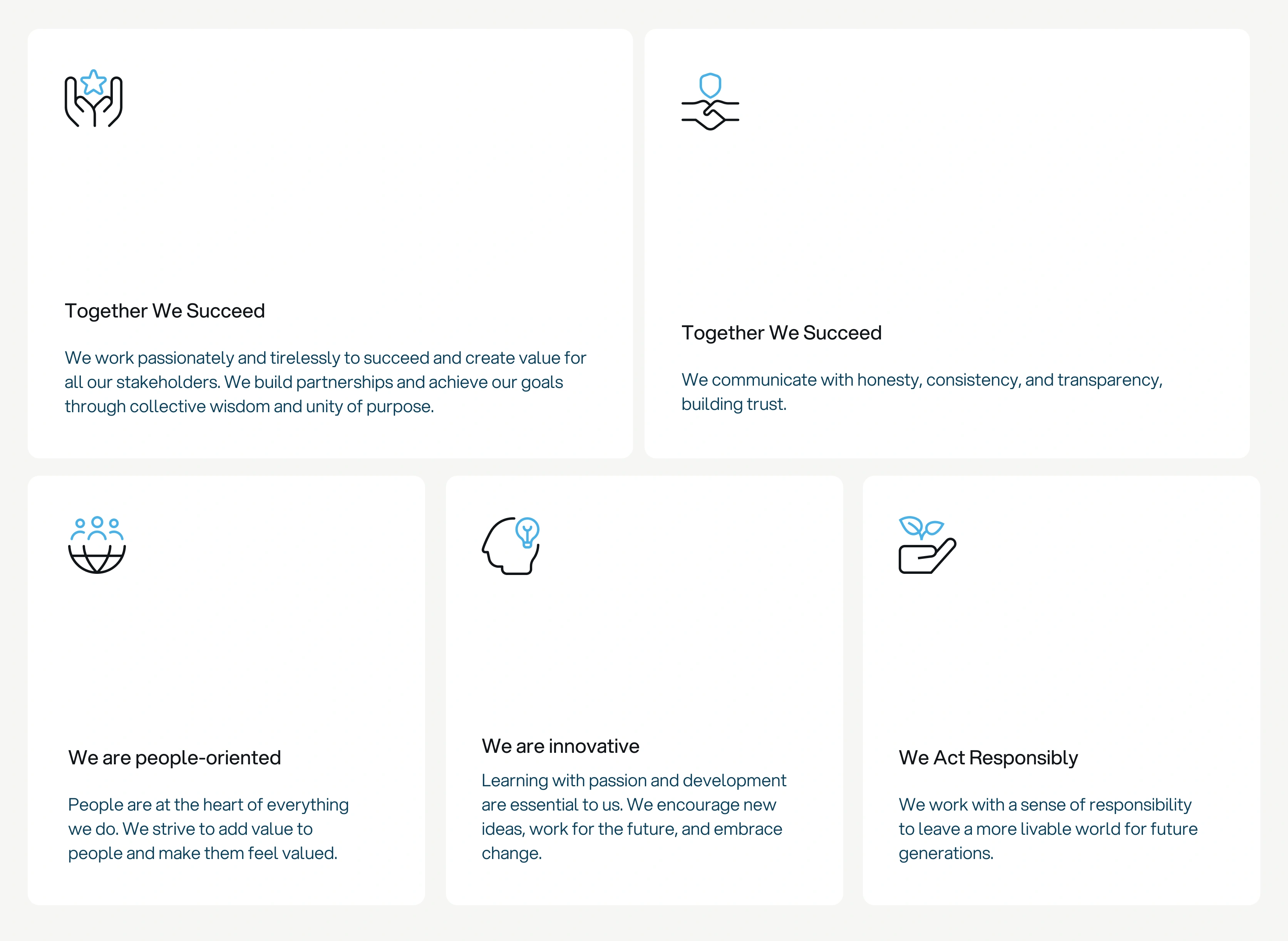
The human side of Deva.
Collaboration, innovation and responsibility. We expressed Deva’s values through human-centred symbols, keeping that warmth in the fine lines and blue accents.
Our ideas didn’t all fit on the page.
Use the left and right arrow keys to browse the images. Home and End move to the start and end. Press Space to pause or resume automatic scrolling. The gallery does not move automatically when reduced motion is enabled on your device.


Let’s get started
Let’s talk about your project.
Tell us what you want to do. We’ll work through the requirements and put together a proposal and timeline for your project.